From: https://www.manhattancontrarian.com/blog/2020-10-5-the-greatest-scientific-fraud-of-all-time-part-xxvii
Full Title: The Greatest Scientific Fraud Of All Time -- Part XXVII
Date: October 05, 2020
By: Francis Menton
It has been more than a year since I last added a post to this series. The previous post in the series, Part XXVI, appeared on August 20, 2019. For all of the prior twenty-six posts, go to this composite link.
There are two reasons for a new post at this time. The first is that there is some new work out from a guy named Tony Heller [aka Steven Goddard]. The new work can be found at Heller’s website here, with a date of October 1. [There is more science in the Heller website article than was captured below. -FNC ] Heller also indicates that he intends to continue to add to and supplement this work. Heller is an independent researcher who particularly focuses on the subject of this series: alterations to past officially-reported government climate data to create an impression of warming that did not exist in the data as originally reported. Heller is quite skilled at going through reams of government climate data, and turning those data into useful graphs to demonstrate his points. However, in the past I have sometimes been frustrated with Heller’s work for not including sufficient links to enable a reader to verify that his assertions about data alteration are correct. Thankfully, in the current piece, Heller has corrected that issue, and provides the links so that you can see for yourself that the government has changed the data it previously reported in order to artificially enhance the apparent warming trend.
The second reason for a new post at this time is that President Trump has — finally! — hired two climate skeptics into positions of authority over the bureaucracy that compiles, and later alters, the climate data. On September 12, Trump named David Legates to the position of Deputy Assistant Secretary of Commerce for Observation and Prediction. And on September 21, Trump named Ryan Maue as Chief Scientist at the National Oceanic and Atmospheric Administration (NOAA). NOAA is the main bureaucracy where the principal climate data are compiled, and is a part of the Department of Commerce. (Another agency, NASA, is also involved in these efforts.). Both Legates and Maue have been known as people who refuse to accept much of official climate orthodoxy. It is completely bizarre that these appointments would only occur less than two months before the election that could turn Trump out of office, but there you go.
Heller’s October 1 piece, titled “Alterations To The US Temperature Record,” is one of the most thorough and careful that he has done on this subject. Note that the piece only deals with the temperature records of the US, not the entire world. The temperature records of the US and of the rest of the world present very different issues for researchers trying to assess the accuracy of government-reported warming trends. For the rest of the world, no contemporaneously-generated data exist for most of the surface area and for most of the time period between the late nineteenth century and now. Before the recent years, there just were no (or very few) measurement stations or instruments for vast regions like the oceans, the Southern Hemisphere, Africa, Siberia, and so forth. Therefore, for those and other areas, much of what passes for historical temperature data, particularly from about 1880 to 1960, has actually been created or interpolated after the fact by computer algorithms, which then just so happen to show the trend that the programmers and their bosses would like to see. But for the US, the situation is different. For the entire period back to the late nineteenth century, there has existed a dense network of ground thermometers to record temperatures throughout this country. Therefore, if prior reported data showed cooling trends, and now you want to report a warming trend, that necessarily requires changing prior reported data. Heller:
The US temperature is very important, because the vast majority of stations which NOAA has long-term daily temperature data for are located in the US.
So, have prior officially-reported US temperatures been altered to create and enhance warming trends? The answer is absolutely, clearly, yes. If you haven’t followed this series prior to now, you may be surprised to learn that fact. Remarkably, as Heller points out, NOAA, and its co-bureaucracy NASA, do not deny that they have altered the data, and don’t even make serious efforts to hide the fact. Heller:
Reality is that the data alterations are no secret, and that NOAA and NASA acknowledge that they do it.
It’s not that the alterations are secret, but rather that the bureaucrats make it as difficult as possible to track the alterations, to learn the basis for the alterations, and to figure out what has changed and by how much. Periodically, new versions of data sets are issued, with no detailed documentation of what has changed or on what basis. When NOAA and NASA come out with their latest breathless press release about the “hottest year ever,” and so forth, there is no mention of prior officially-reported data that would contradict the claim. Often earlier data have simply been written over as new, altered data are substituted, making it impossible to track the changes unless you happen to be fortunate enough to have captured a screenshot of the old data before it got modified.
Nevertheless, there are notable examples where the prior data continue to be accessible, and Heller has done some yeoman’s work to compile a number of damning instances. I urge you to read his whole piece, but I’ll give you here what is undoubtedly the most notable and shocking example. In 1999, then NASA/GISS head James Hansen, a noted climate alarmist, came out with a big research paper titled “GISS analysis of surface temperature change.” Heller links to this paper in his piece, and you can see from the url that it is an official NASA document. The paper was part of the then growing climate alarm movement at the time, and contained a collection of claims designed to scare you out of your wits about impending climate change apocalypse. Examples from the abstract:

The rate of temperature change was higher in the past 25 years than at any previous time in the period of instrumental data. The warmth of 1998 was too large and pervasive to be fully accounted for by the recent El Nino. . . .
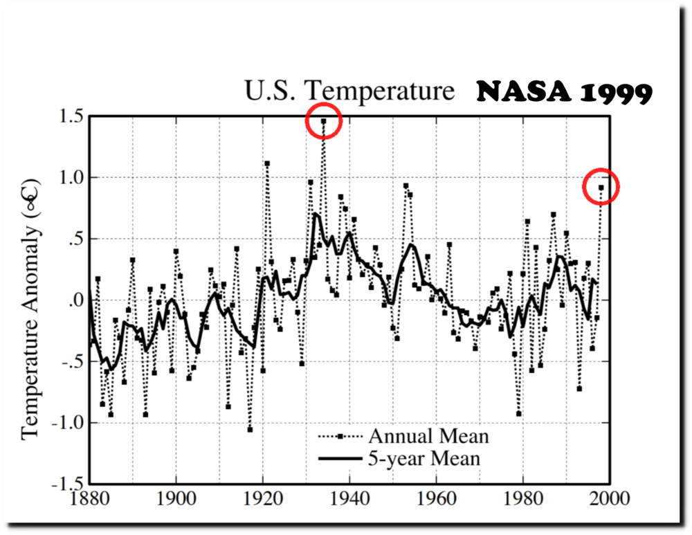
And so on and on. But Hansen made the mistake of including in the paper a graph of the official NASA temperature data for the US from 1880 to 1999, as it existed at that time. You can find that graph as Exhibit 6 to the 1999 paper. Here it is:

What jumps off the page — and what Heller drives home with his red circles — is that 1934 is the warmest year, approximately 0.6 deg C (or one full degree F) warmer than 1998, which in fact is only the fifth warmest year on this chart, also trailing 1921, 1931, and 1953.
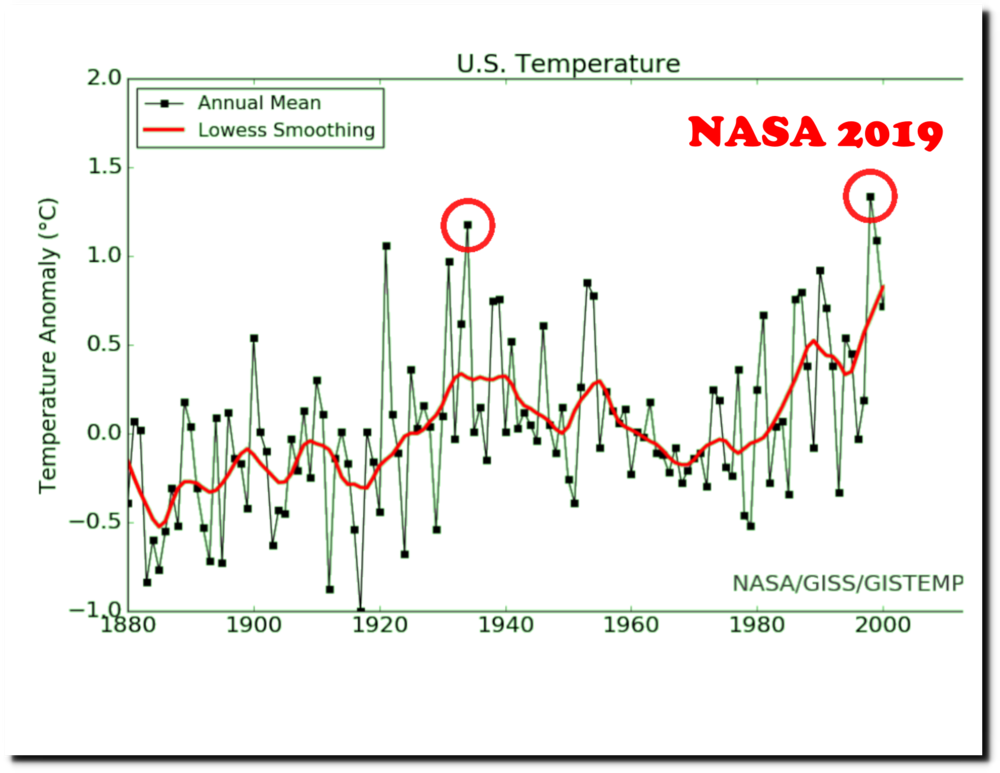
But today NASA has a new chart up on its website, with data through 2019, supposedly generated out of the same data base, but just a new and improved “version” of same. You can go to that link to see NASA’s full chart through 2019, and to verify that this is in fact an official NASA chart. But Heller takes the step of truncating this 2019 chart at 2000 to emphasize the comparison to NASA’s prior chart that went to 1999. Here is the 2019 NASA chart truncated to 2000:
Now 1998 is notably warmer than 1934, and for that matter, also warmer than 1921, 1931 and 1953. The earlier years in the chart have all gotten cooler and the later years all warmer. A declining trend in temperatures from the 1930s to the 1990s has been turned into a warming trend.
How did that happen? What is the basis for the alterations? You will never get that answer out of NOAA or NASA.
Go through Heller’s post to see other examples of earlier and later NASA and NOAA temperature charts, for instance for the state of Texas, or for average daily high temperatures for the full US. Somehow, in each case, cooling trends have been turned into strong warming trends, particularly from the 1930s to 1990s.
And finally, Heller’s pièce de résistance: He calculates the quantitative alterations in the data for each year, and demonstrates that the effect of the alterations is to make the temperature graph match near-perfectly to the changing level of CO2 in the atmosphere. The data have been altered to fit the hypothesis. Heller:
The implication of this is that the huge adjustments being made to the US temperature record are being made to match global warming theory, which is the exact opposite of how science should be done. The unadjusted data shows essentially no correlation between CO2 and temperature.
So, Messrs. Legates and Maue, you now have at least a few months to blow the lid off this scandal. Really, that is all the time it should take. The American people deserve to have an honest accounting of what is going on. Now is our chance.